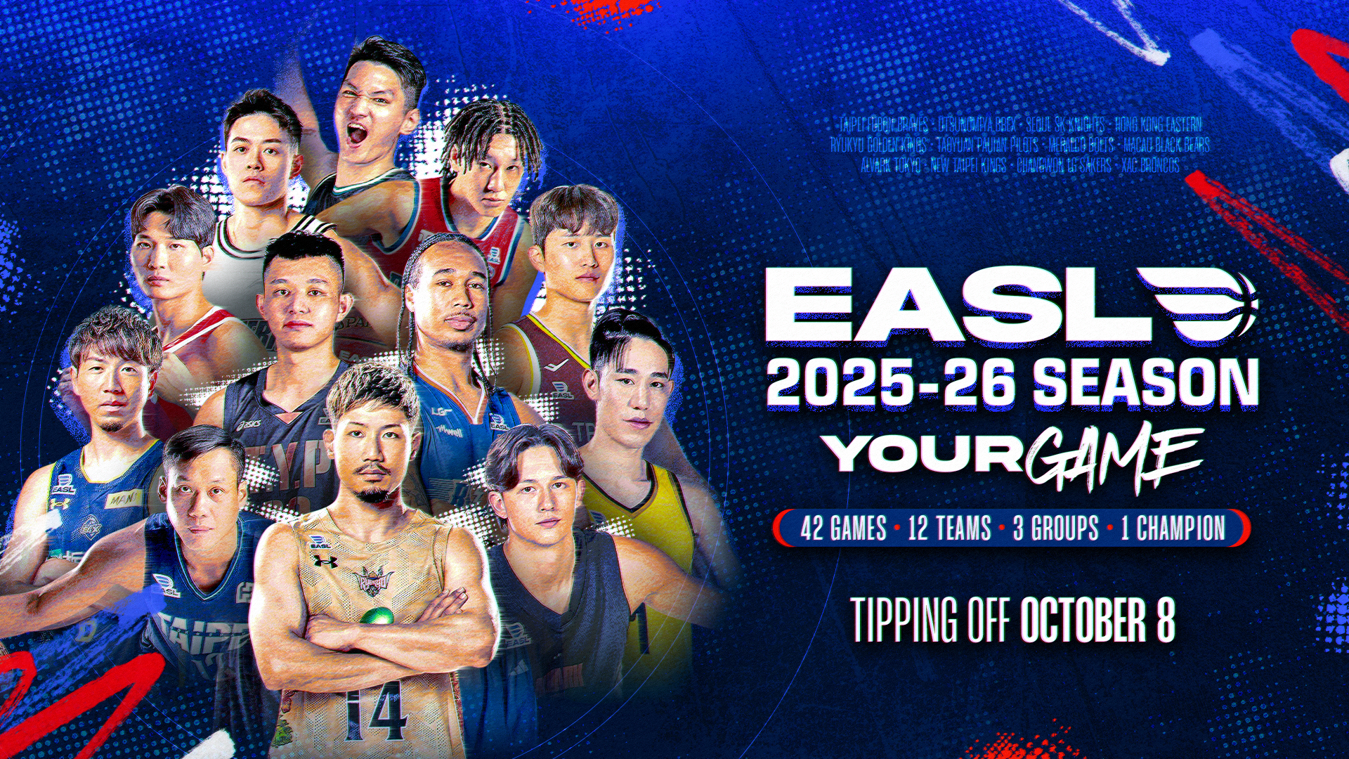
EASL Rebrand — Building Asia’s Premier Basketball League
To become a premier league, you need more than great games. You need a brand that commands it.
The East Asia Super League had the ambition to be recognized as Asia’s premier basketball competition, but its brand did not fully reflect that level. The identity lacked consistency, clarity, and a sense of prestige needed to stand alongside global leagues. As the league expanded across multiple markets, there was a growing need for a unified visual system that could elevate perception, strengthen recognition, and capture the energy of basketball culture in Asia.
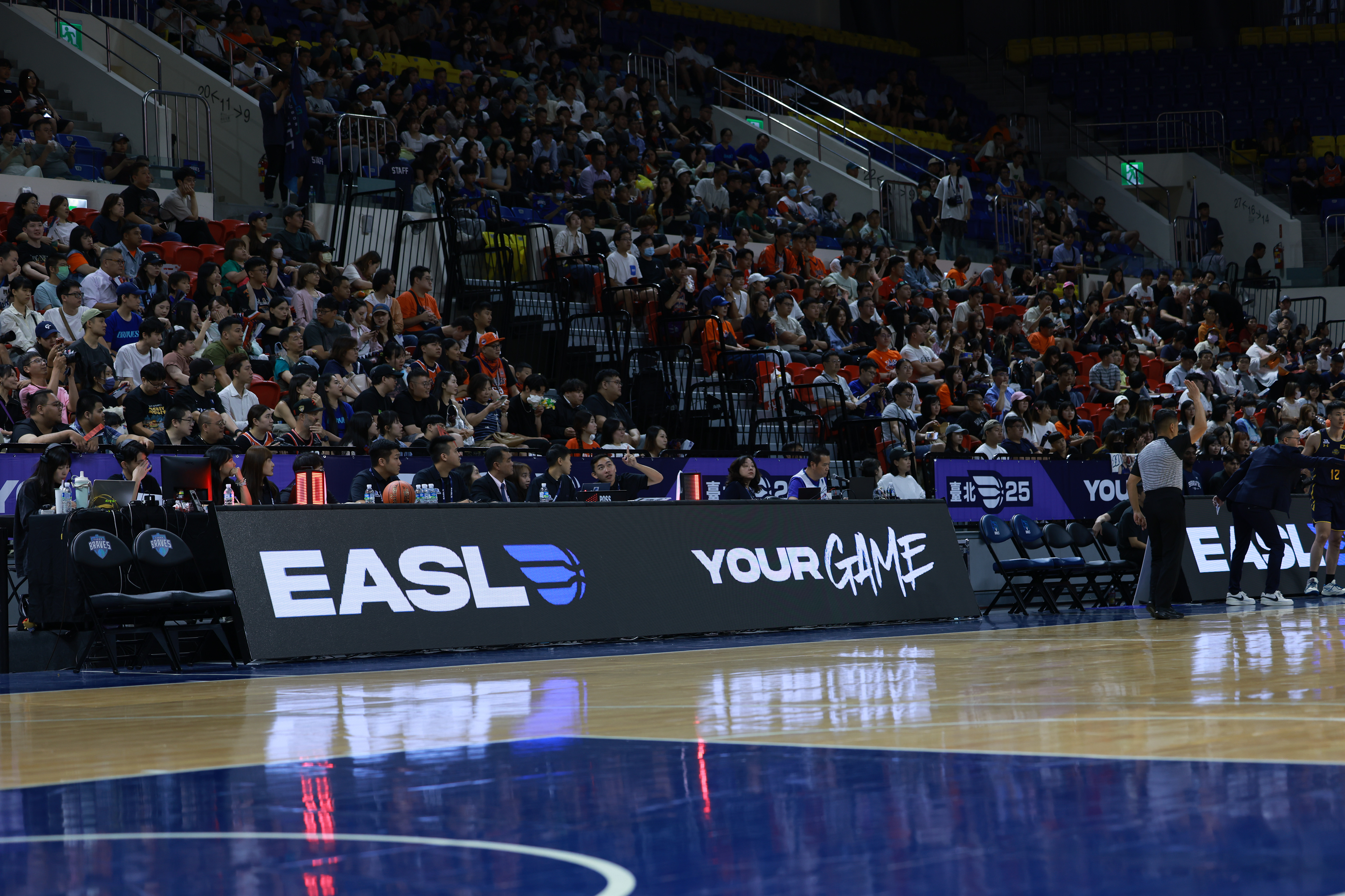


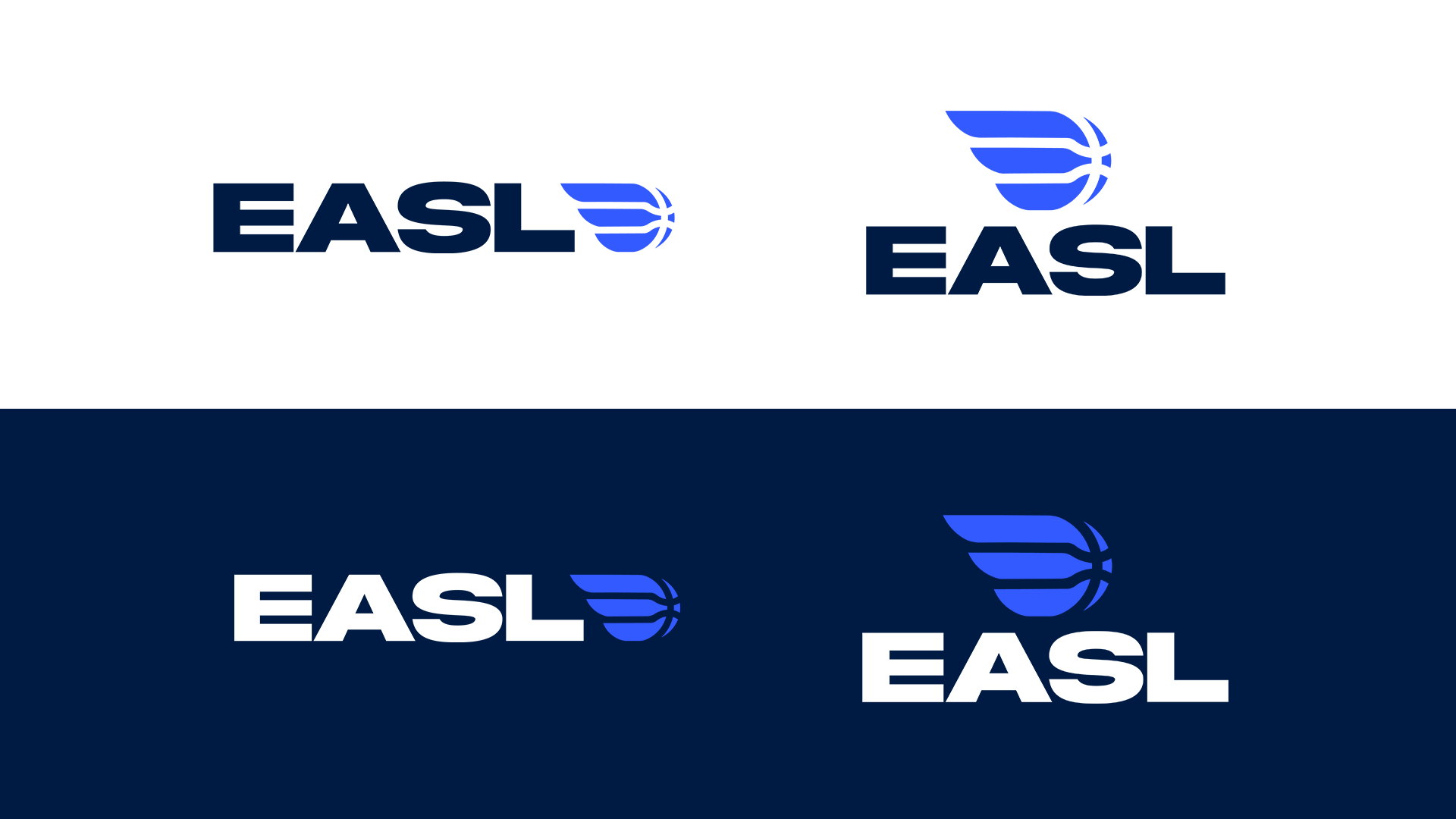
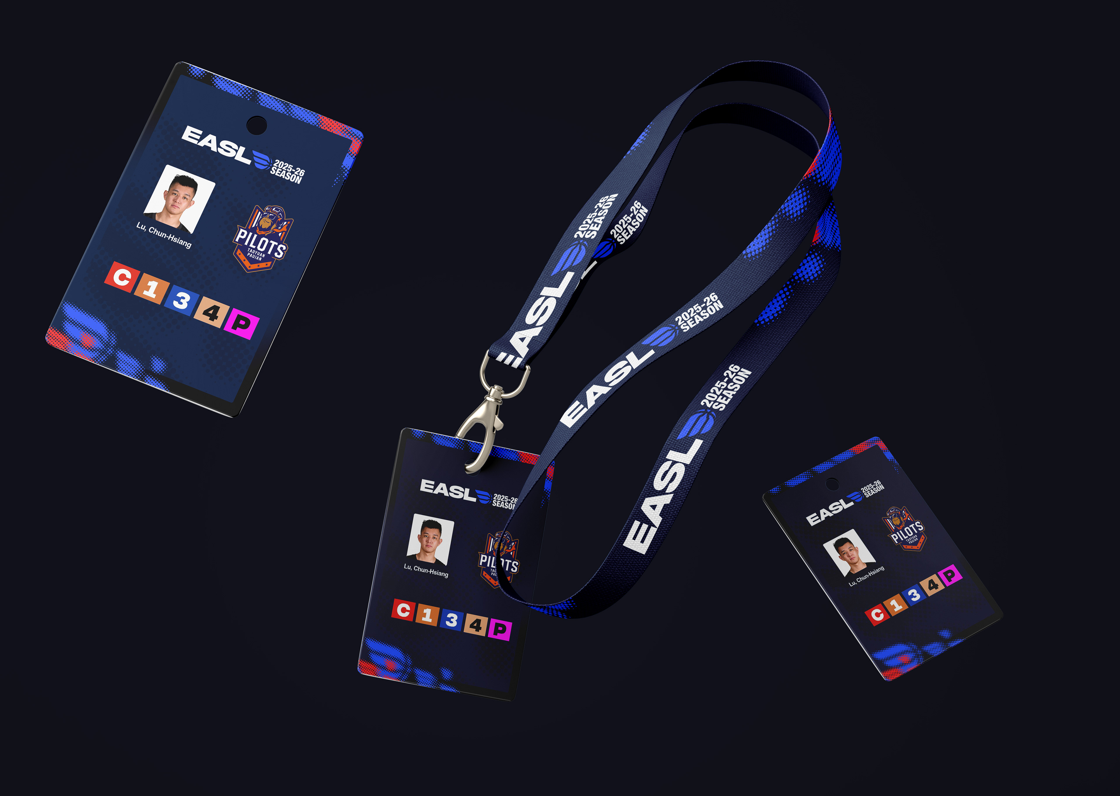
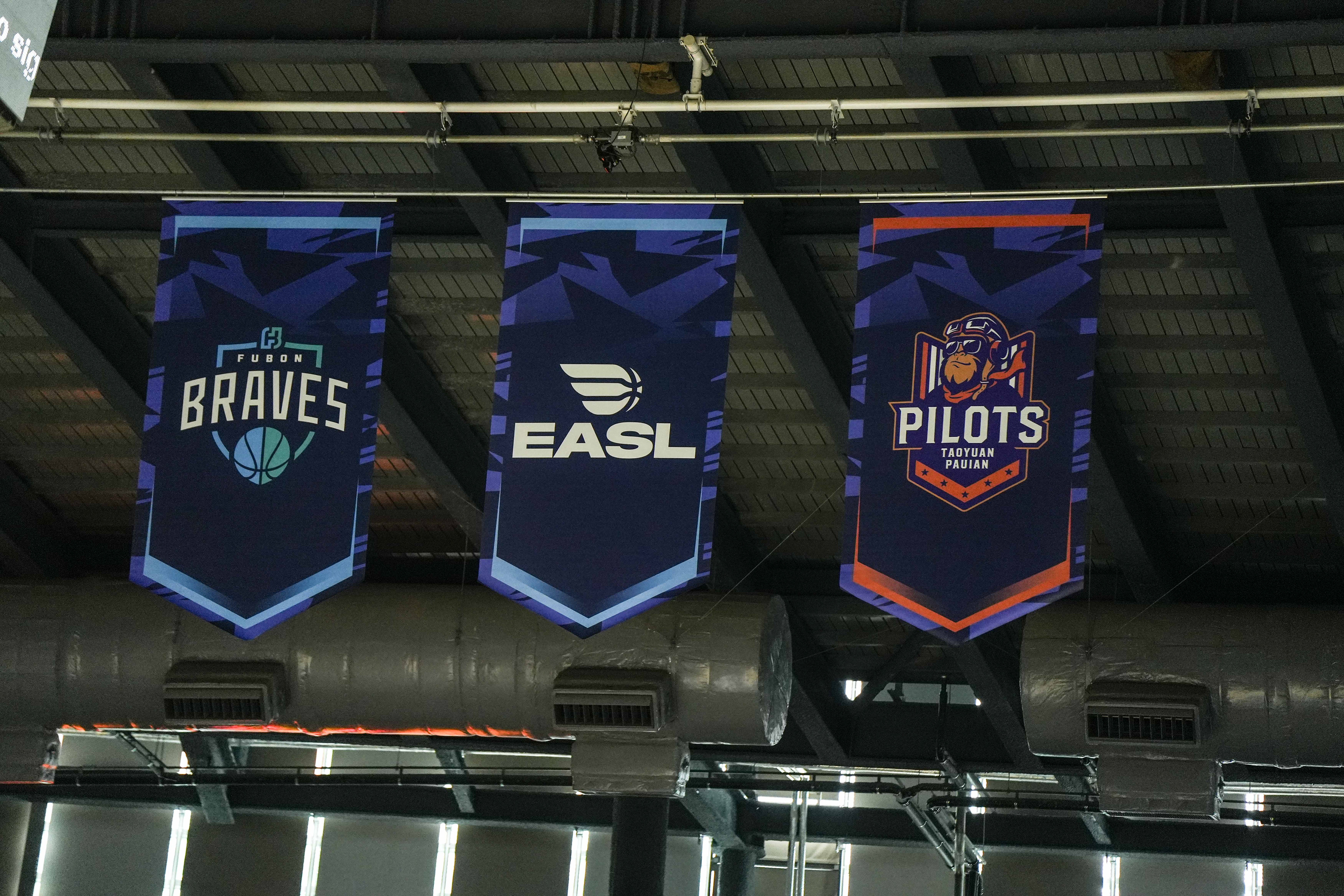
The rebrand focused on repositioning EASL as a premier, modern basketball league built for both performance and culture. The approach was to create a cohesive identity system that balances prestige with energy — combining bold visuals, dynamic motion, and a flexible design language adaptable across markets and platforms. Every element was designed not just for aesthetics, but for scalability, ensuring the brand could live seamlessly across broadcast, digital, and in-venue experiences.


Seasonal Visual Language
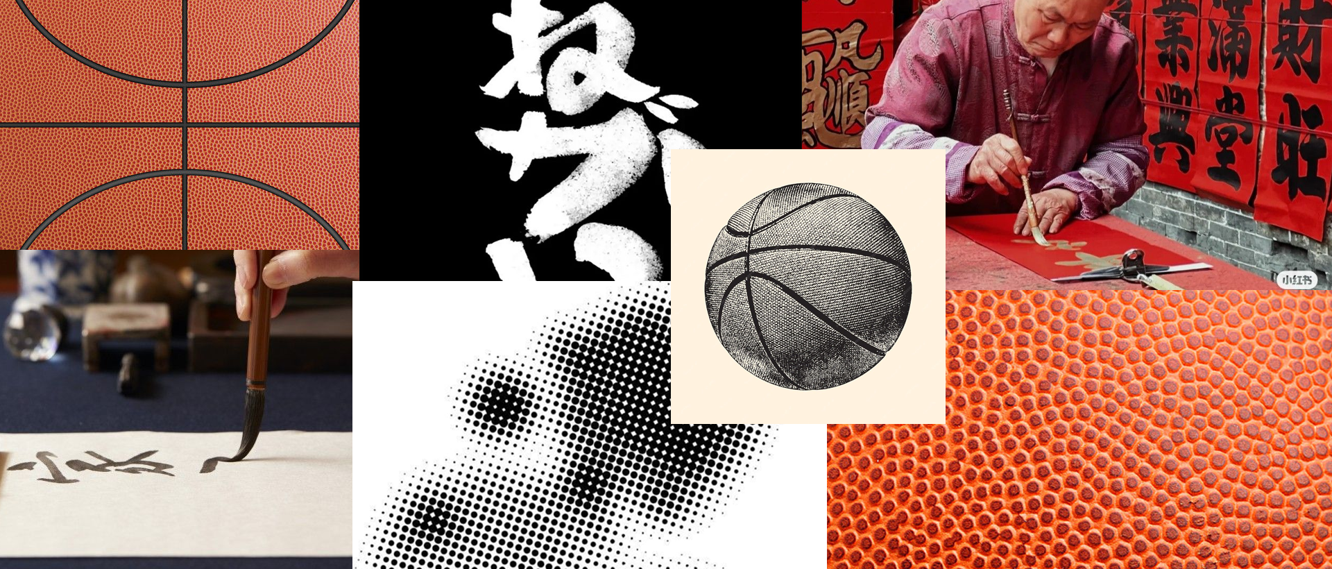
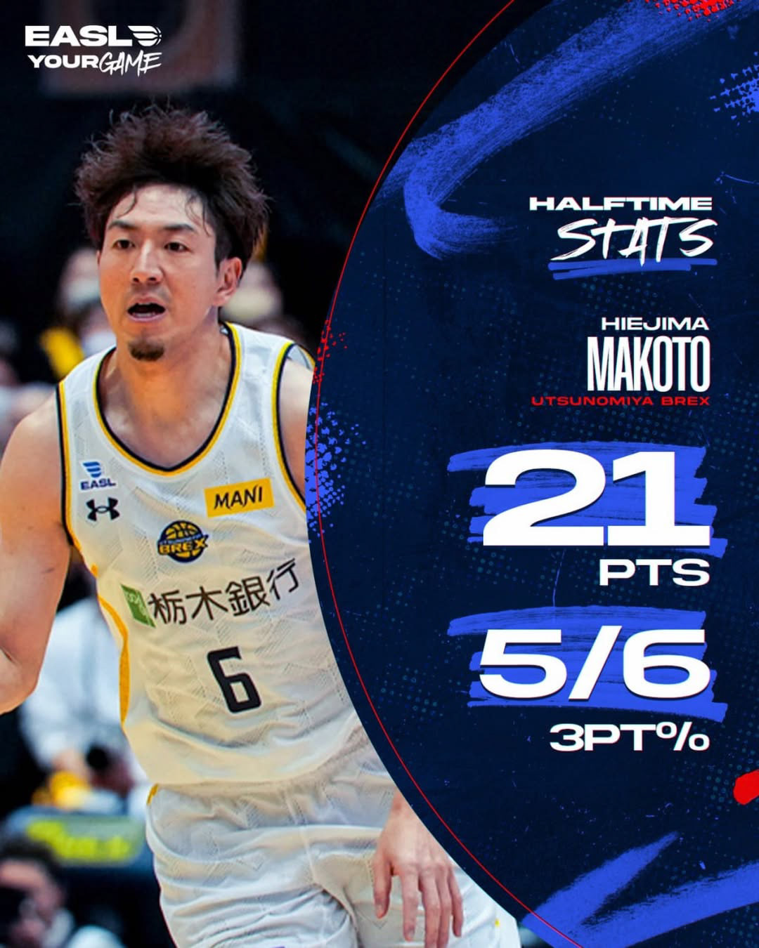
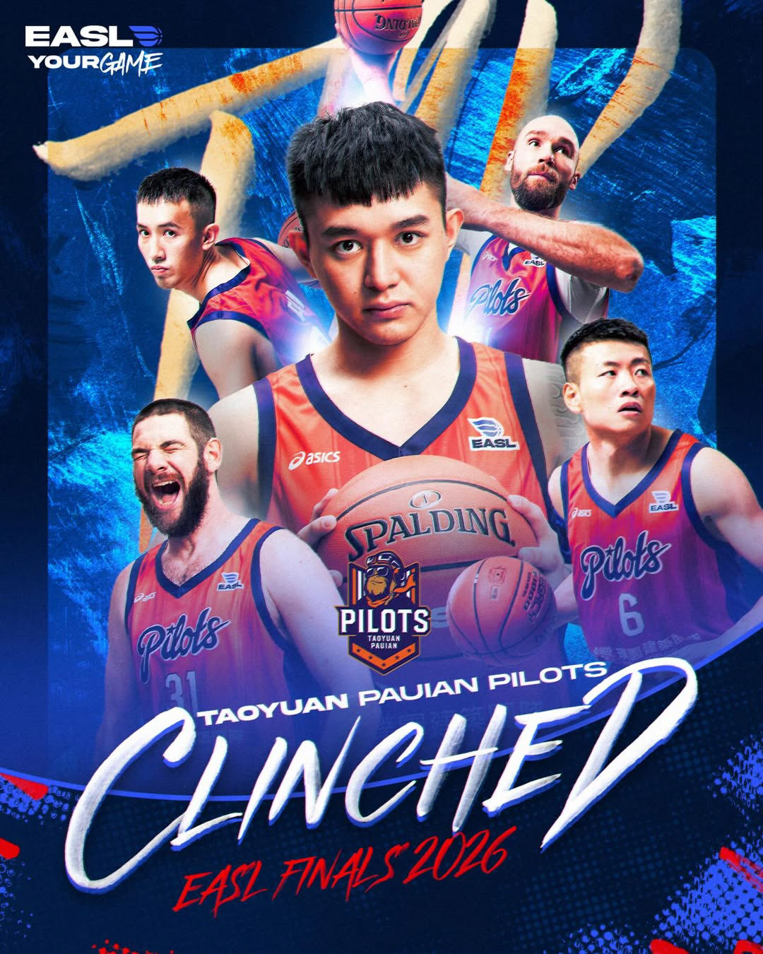
The visual language was rooted in the game itself. We incorporated basketball textures — from rubber grain to surface imperfections — to ground the identity in authenticity. This was layered with Asian calligraphy-inspired strokes, adding a cultural edge that reflects the league’s regional identity. The result is a system that feels both raw and refined — where sport and culture exist in the same frame.


Developed by the EASL Creative Team
Hadrein Damalerio // Senior Creative Manager
Gelo Avendano // Lead Graphic Designer
Ralph Salcedo // Graphic Designer
Benn Adorna // Broadcast Designer
Elajah Alcoriza // Video Producer
Darwin Cambe // Video Producer
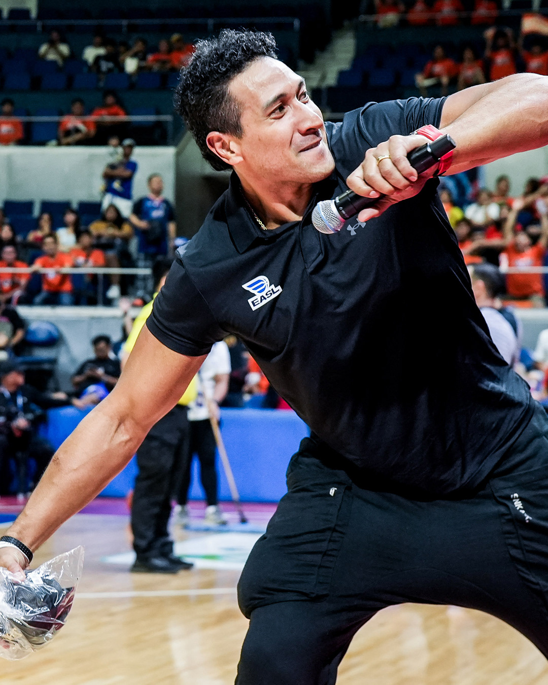
Mags Reyes // Senior Photographer
Mags Reyes // Senior Photographer