Overview:
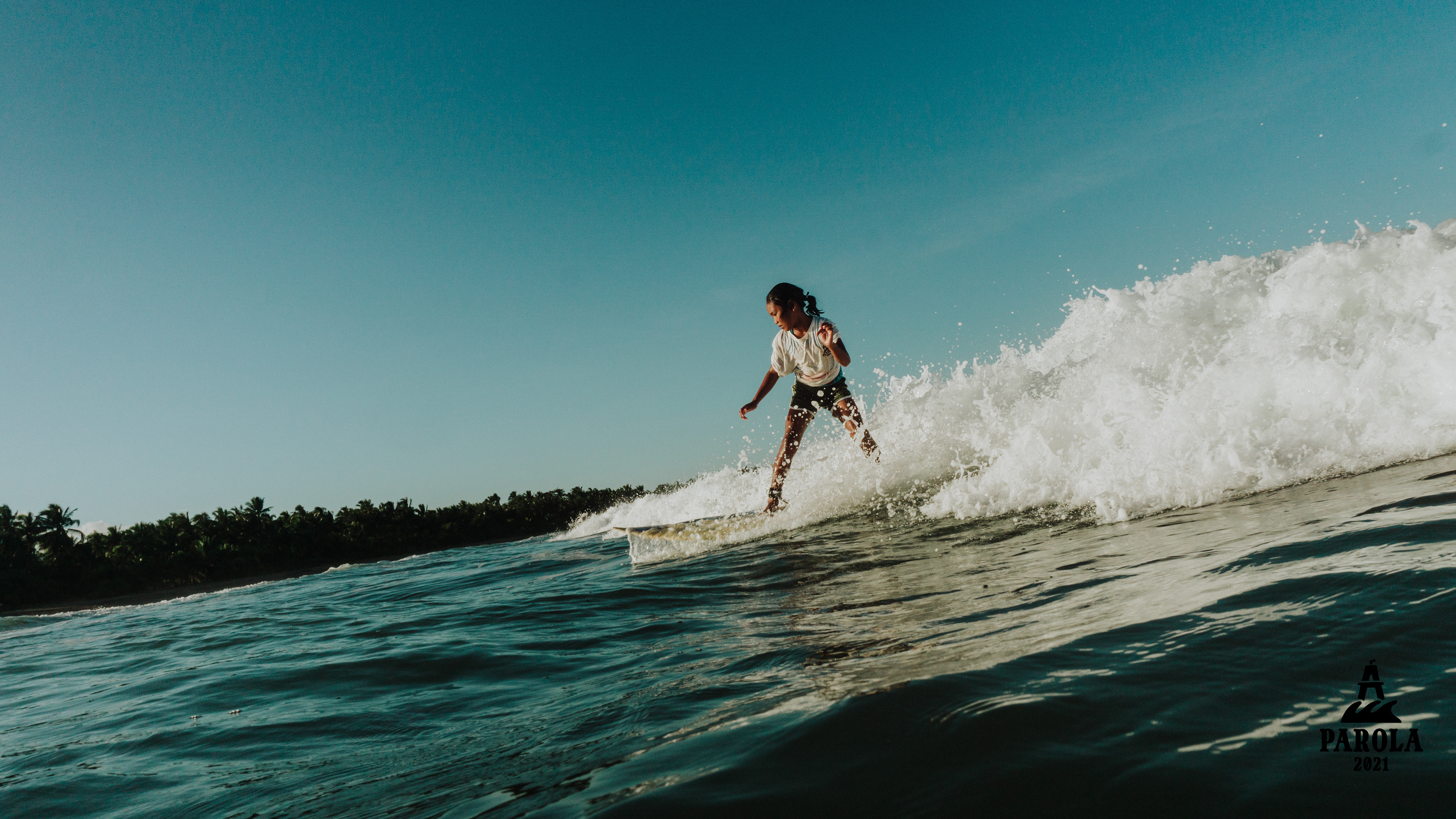
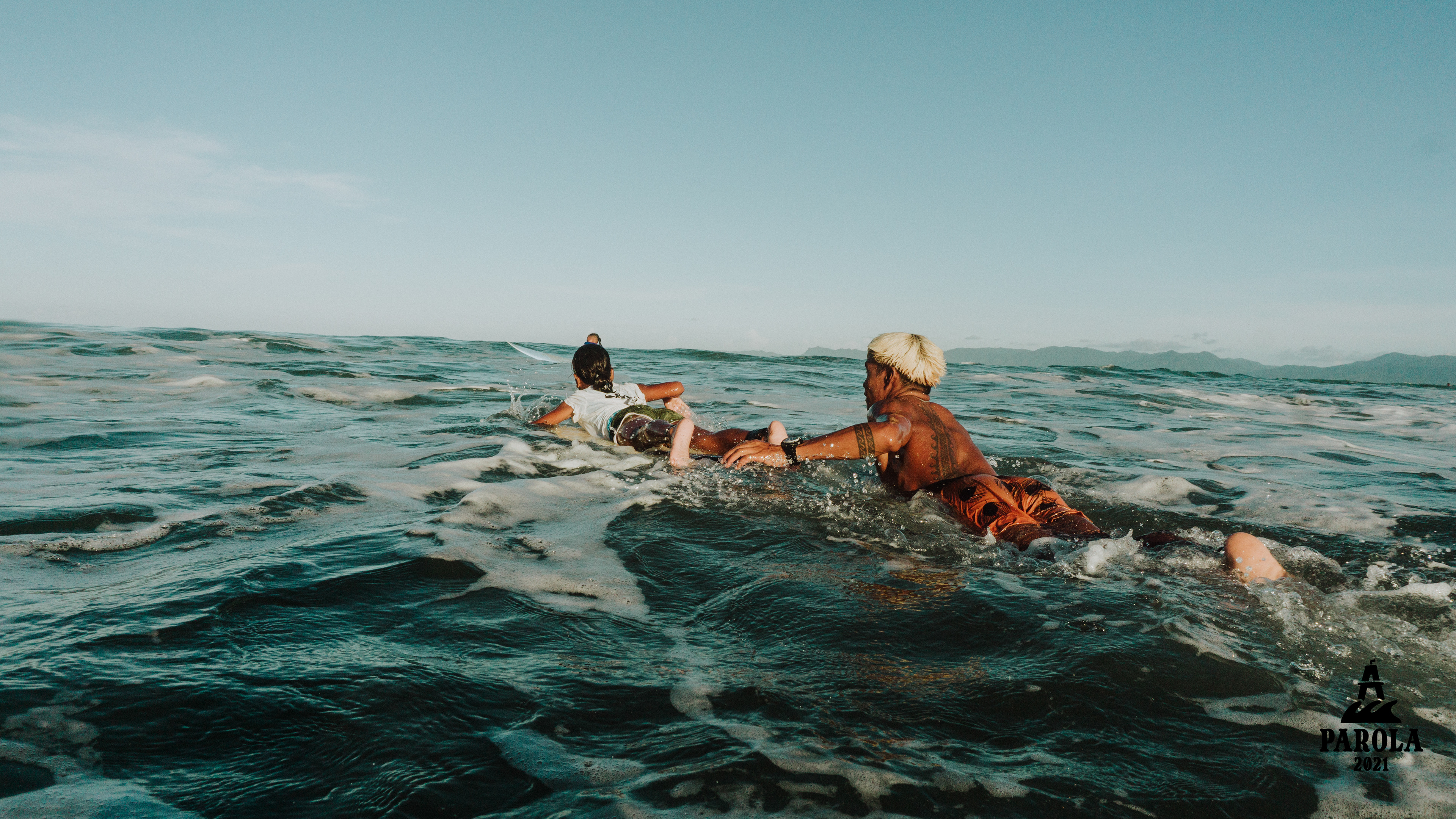
Parola is a local surfing competition in Cantilan, Surigao del Sur that aims to cultivate the local surfing talents.
Problem:
There had been several surfing competitions in the locality but lacks consistent and unique visual identity that could communicate what the event's goal is.
Solution:
The solution was to create a consistent visual identity for the brand which will be potentially used annually for the competition. Coming up with a brand name was a strong solution for the event to have a better recognition.
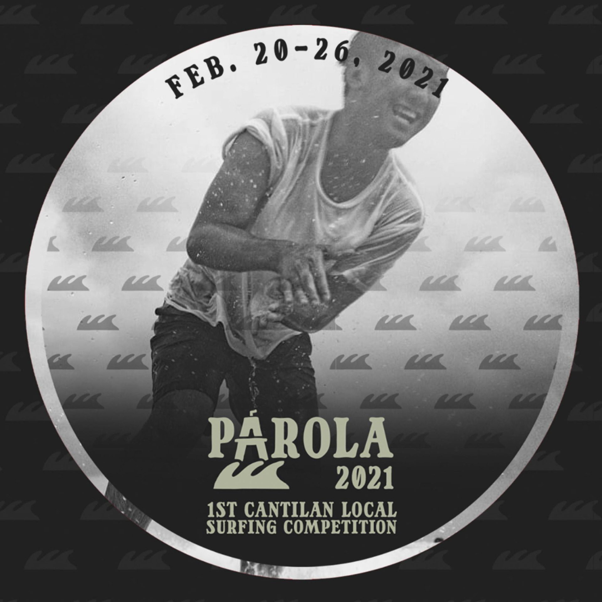
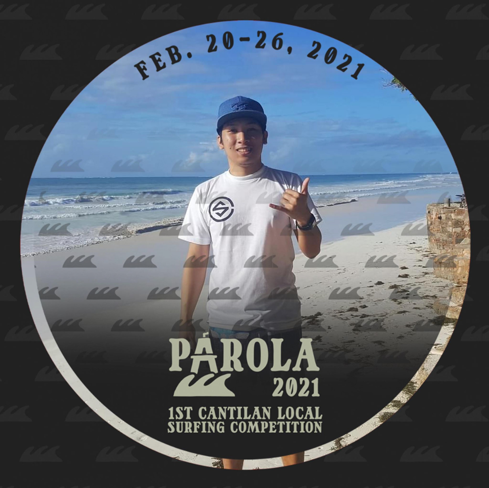
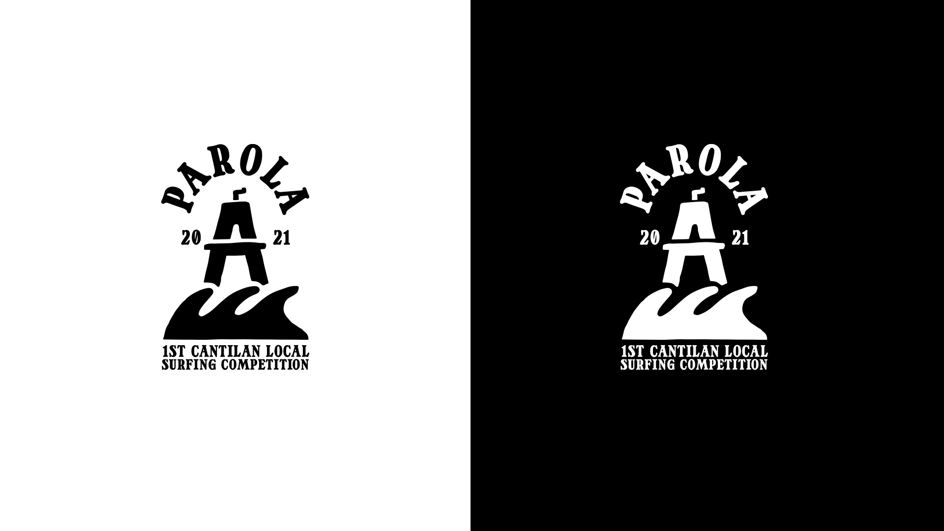
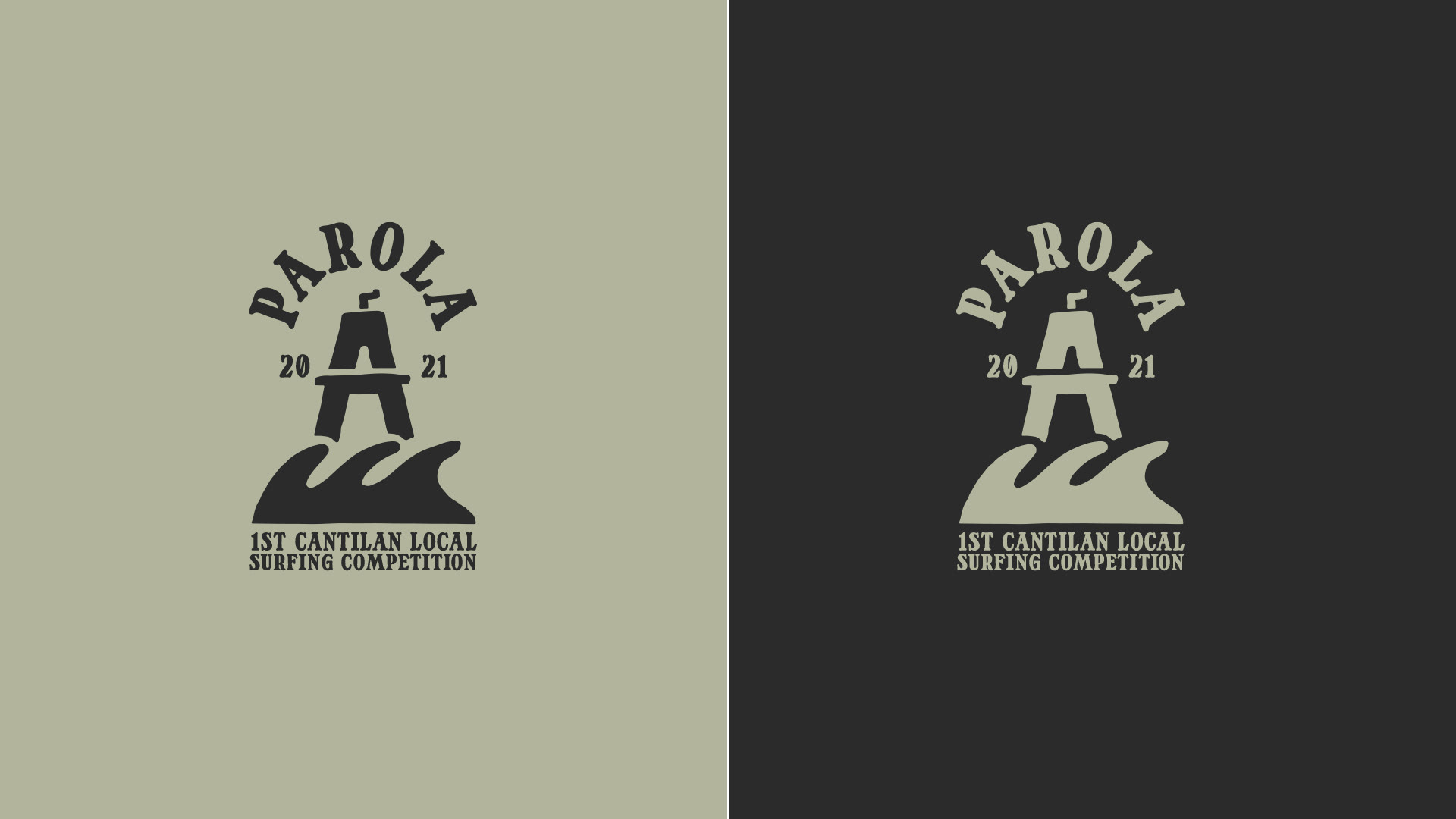
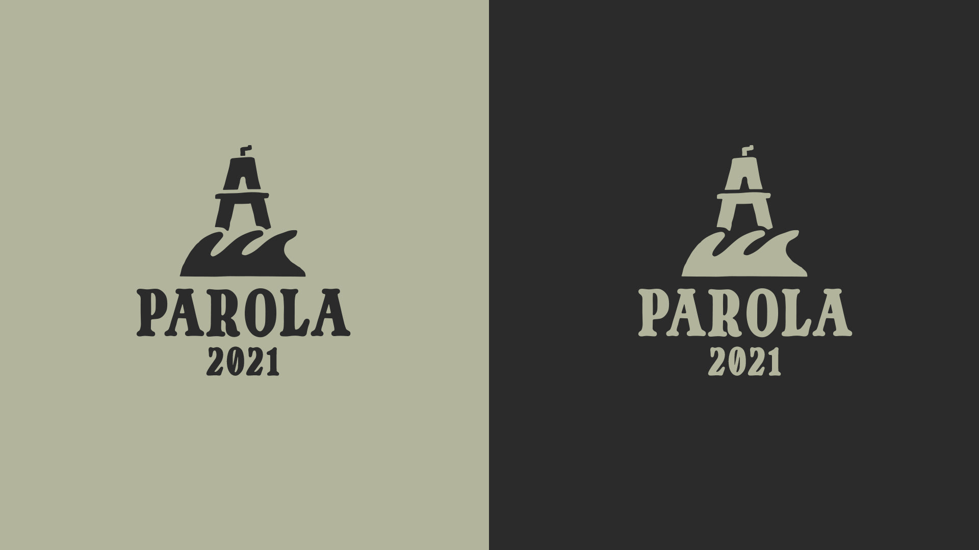
PAROLA 2021
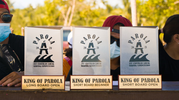
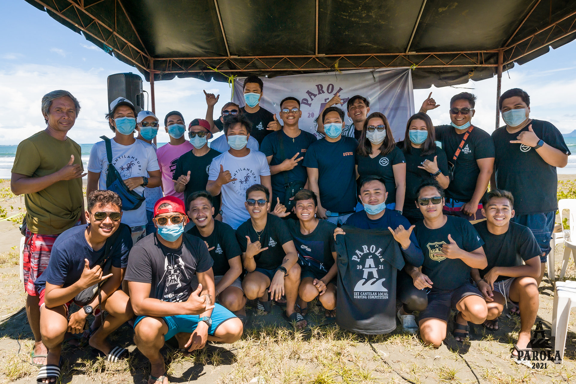
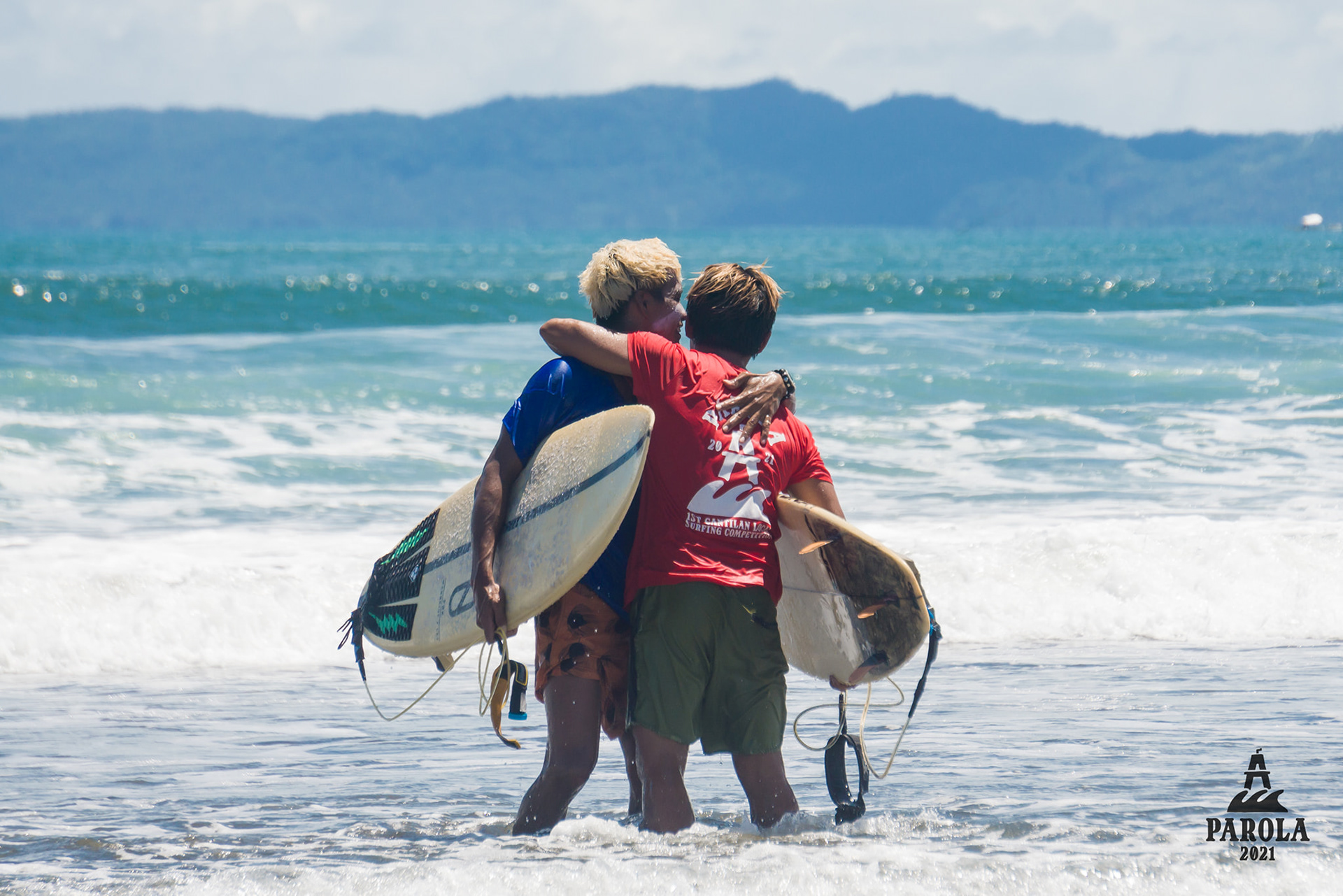
1ST CANTILAN LOCAL SURFING COMPETITION
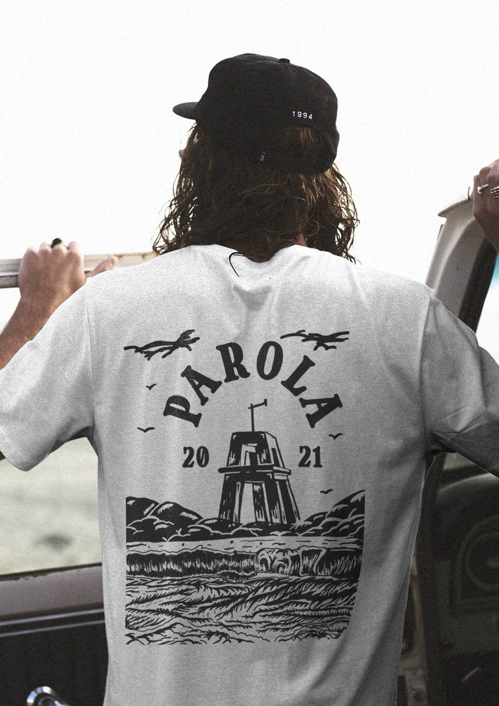
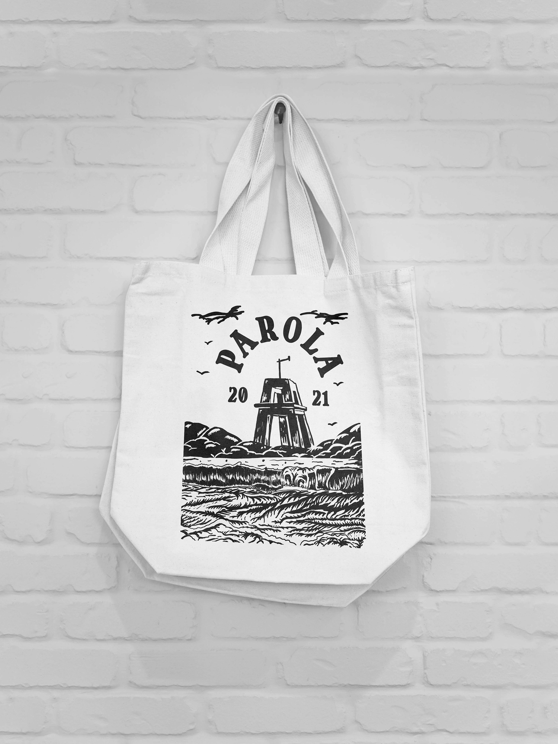
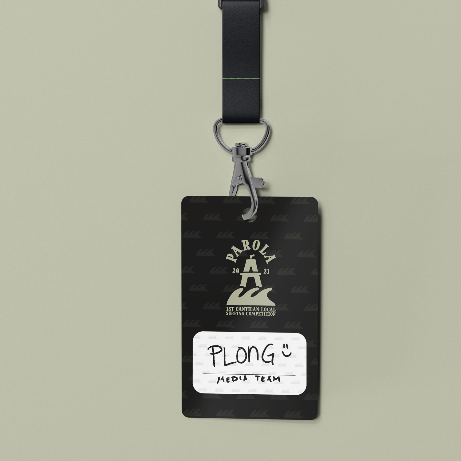
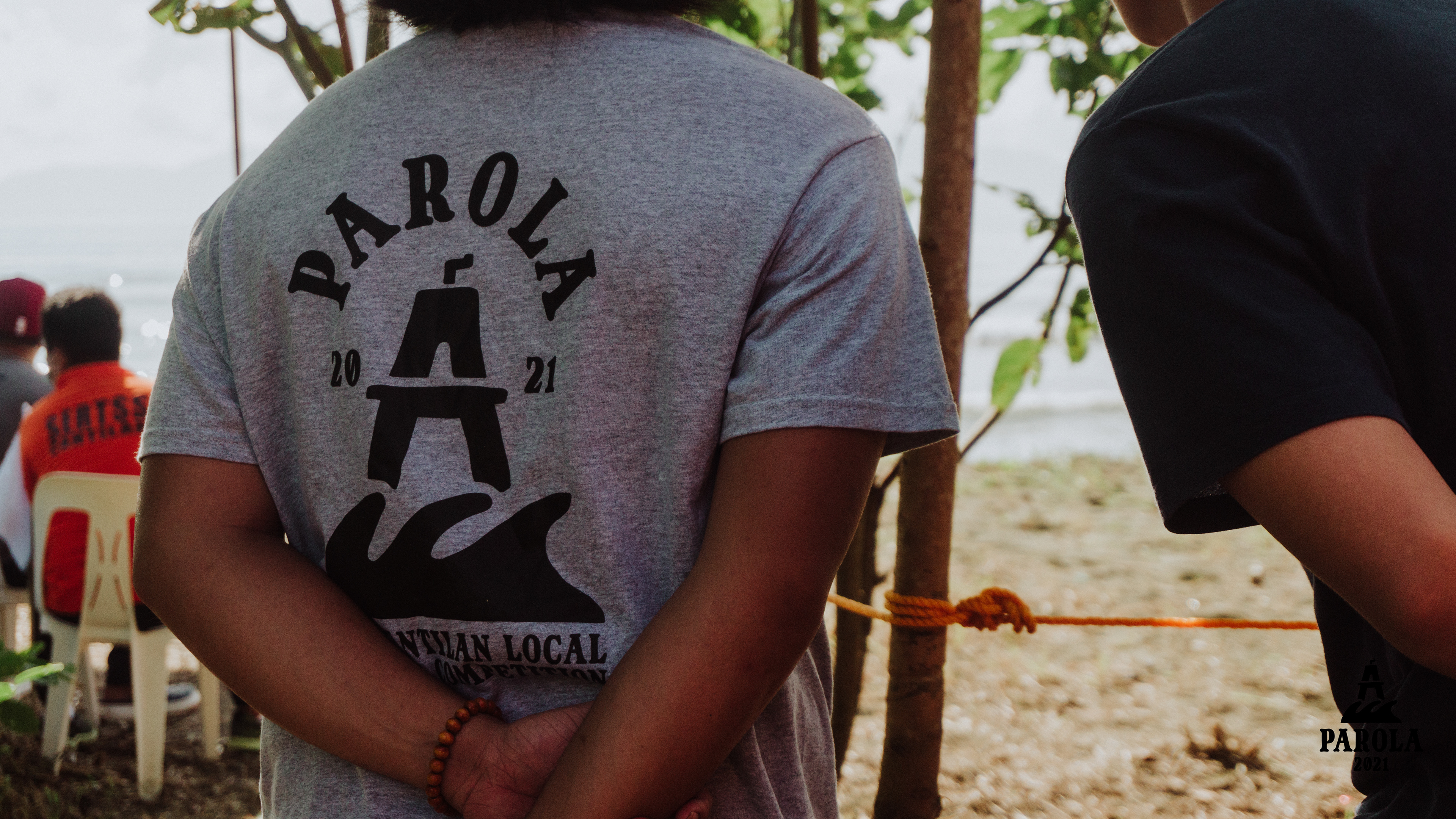
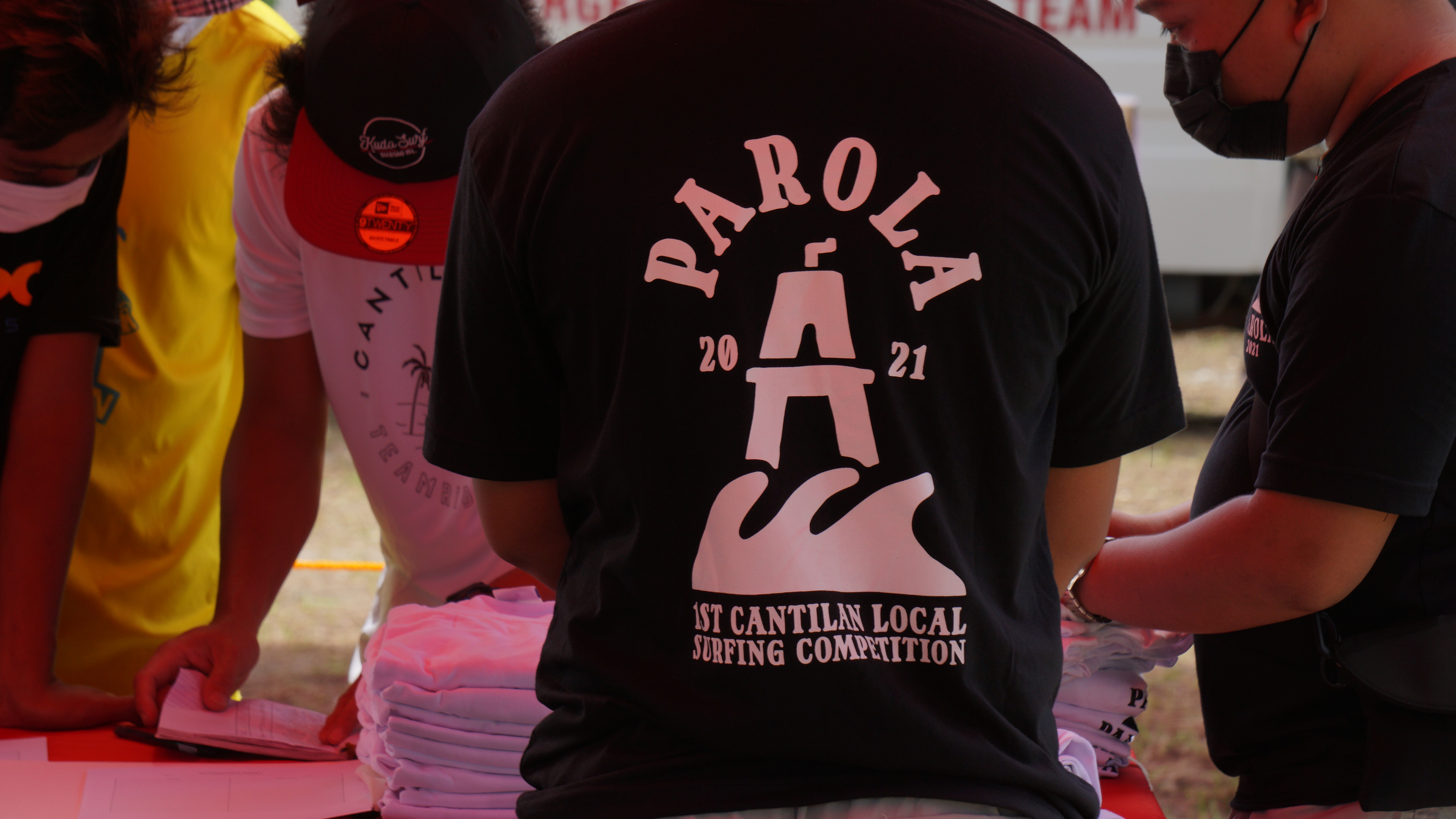
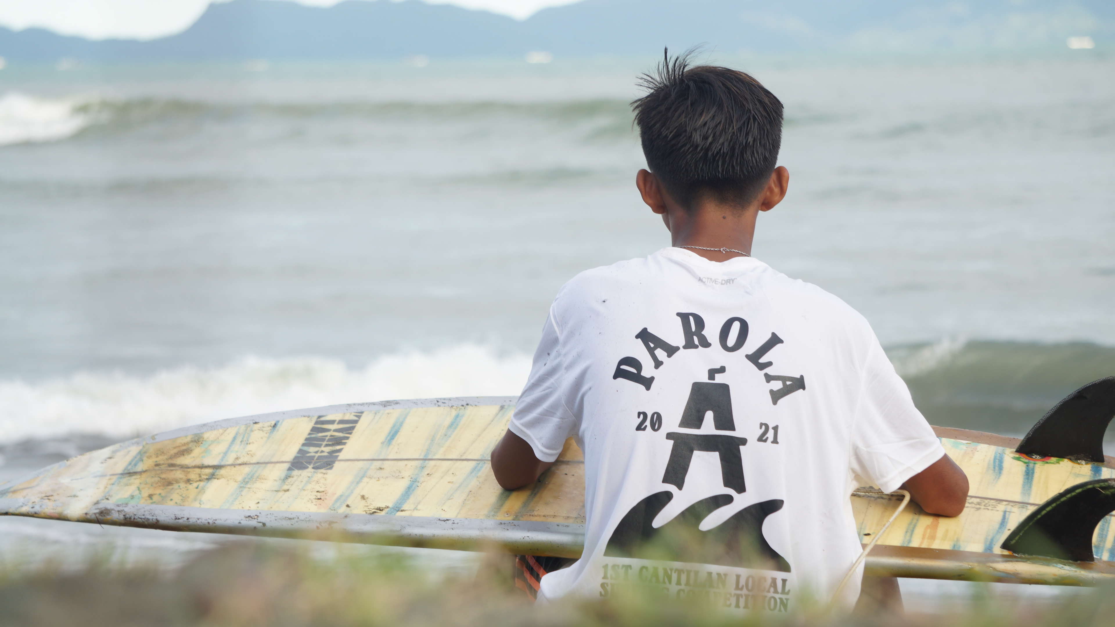
The visual identity of the event captures the essence of Cantilan's rich history in surfing. Cantilan is rich with surf spots and one of which is the Parola Beach Break, where the Cantilangnon surfing scene started. Borrowing BJ Cabaltera's typeface, Nalinak, the Parola 2021 type brings out the local vibe. The symbol is a simplified lighthouse with waves which reminds us about the history of the Parola.
Project Touchpoints:
Brand Naming, Logo design, Merch design, Event video teaser, Event aftermovie.









A project by
Hadrein Damalerio
Stork Design Co.